Enhancing the
Washroom
Experience

Client
Kimberly-Clark
Industry
Professional
Scope
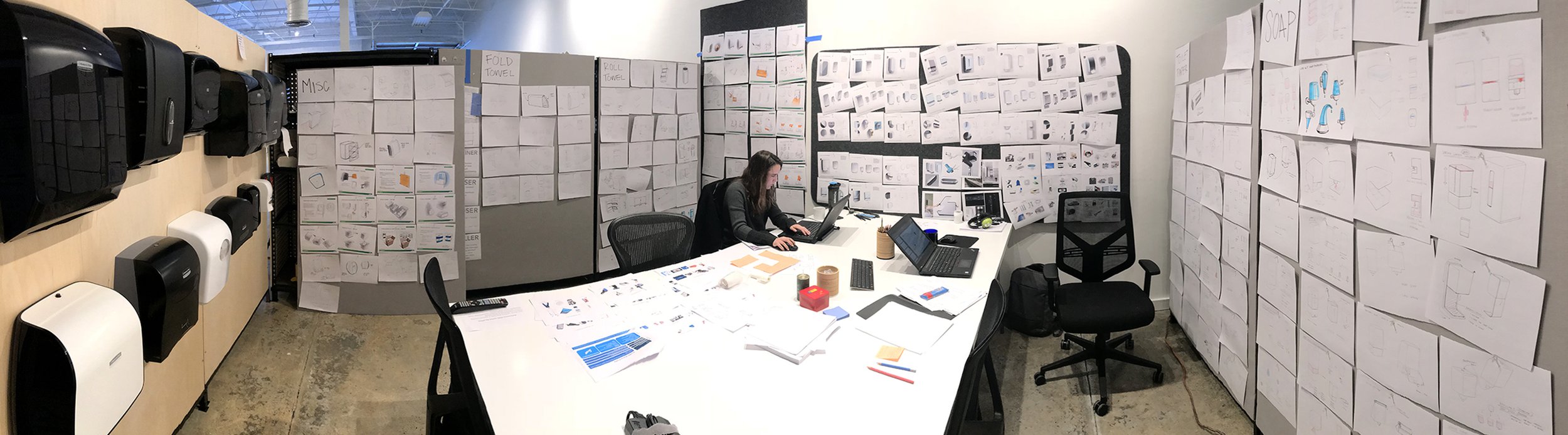
Industrial Design
User Experience Design
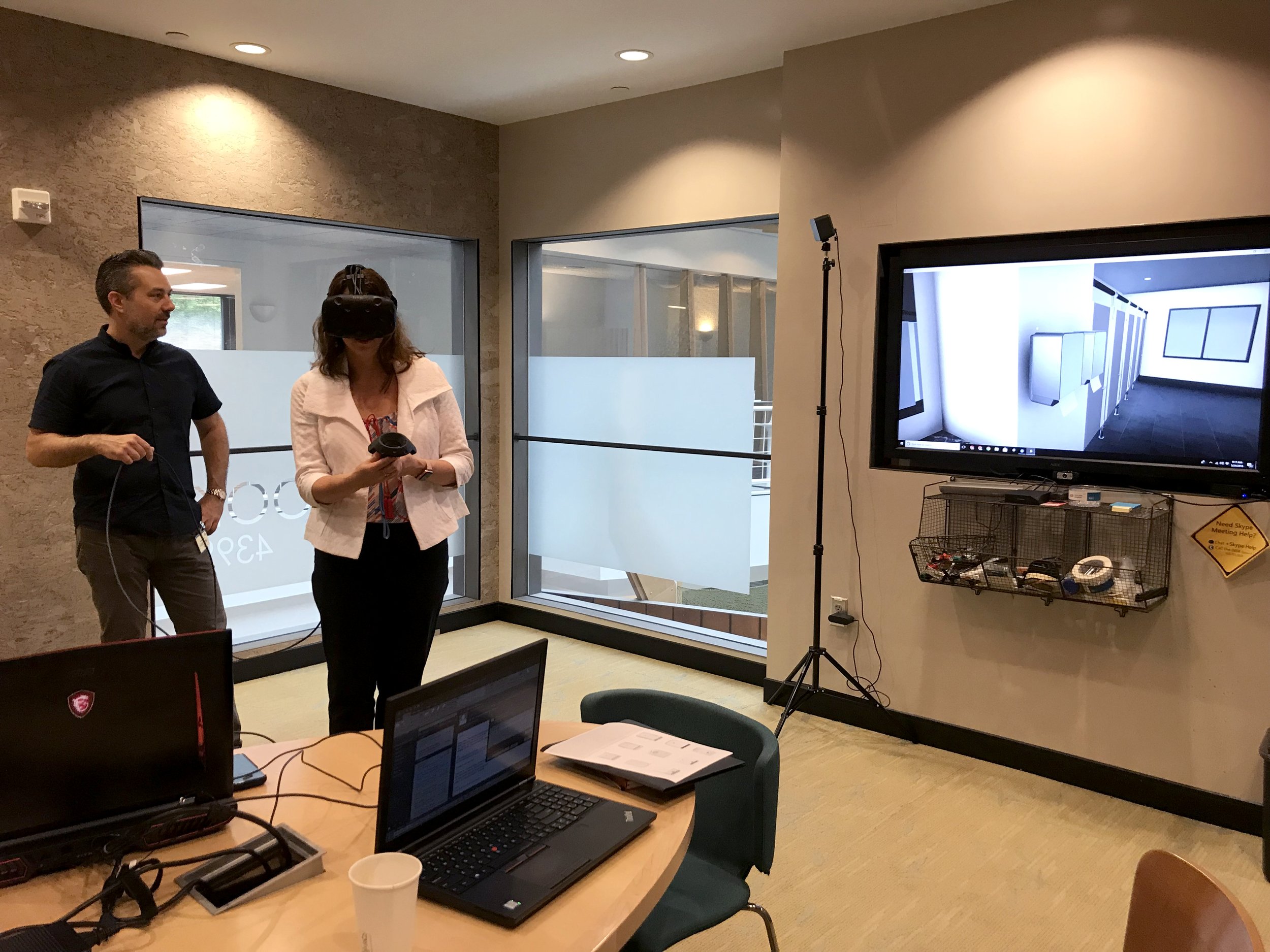
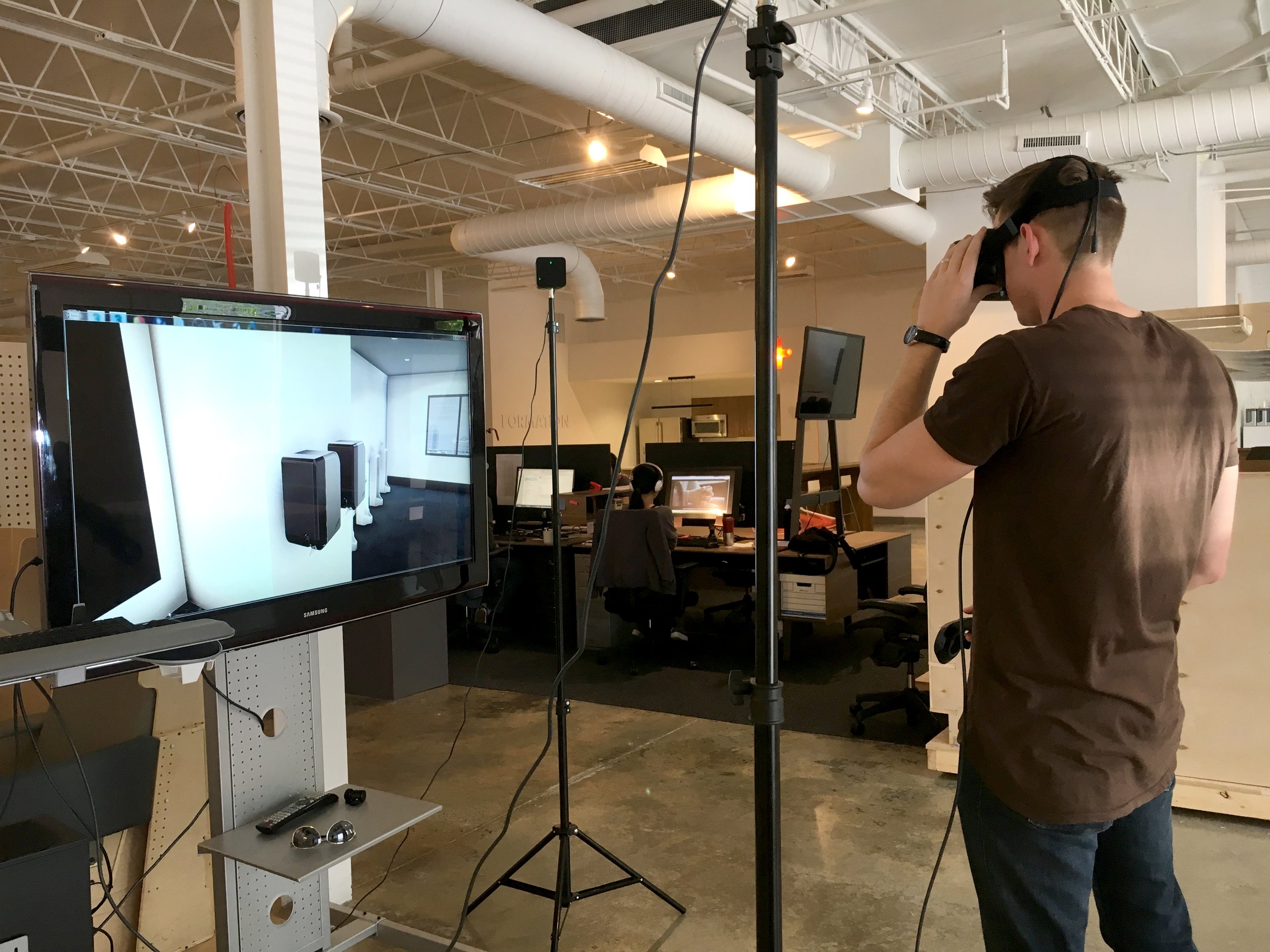
Evaluative Research
The ICON family has had a major impact on how Kimberly-Clark designs new products. In the past, development was object-centric and focused on protecting the paper products. Now, new product development focuses on people. ICON dispensers are the result of a meticulous human-centric design process that sought to understand and empathize with the needs of a broad range of users.
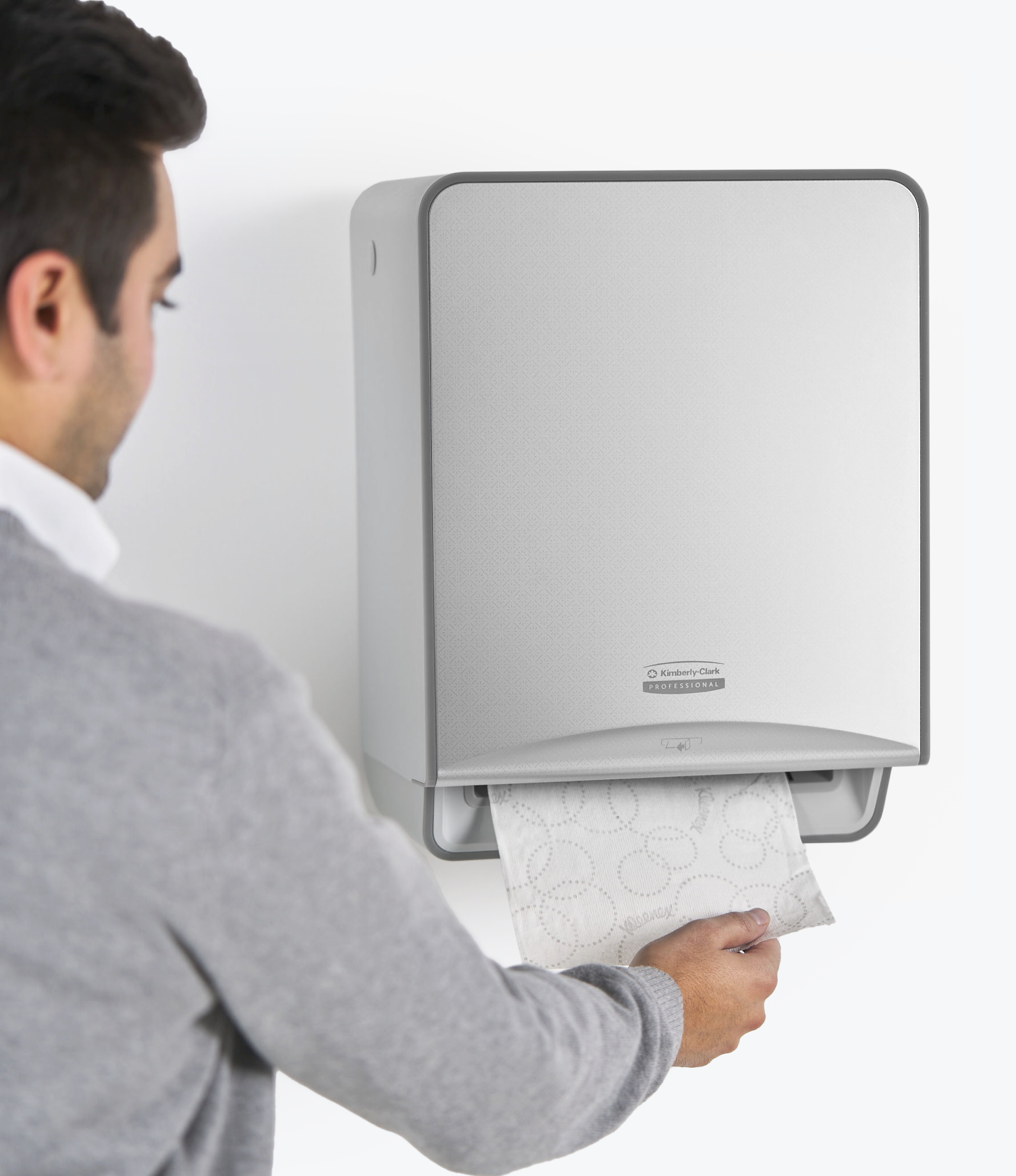
Washroom users are rewarded with a highly intuitive, delightful, frustration-free user experience that never embarrasses with unnecessary hand waving, waiting, or being left without towels, soap, or toilet paper.


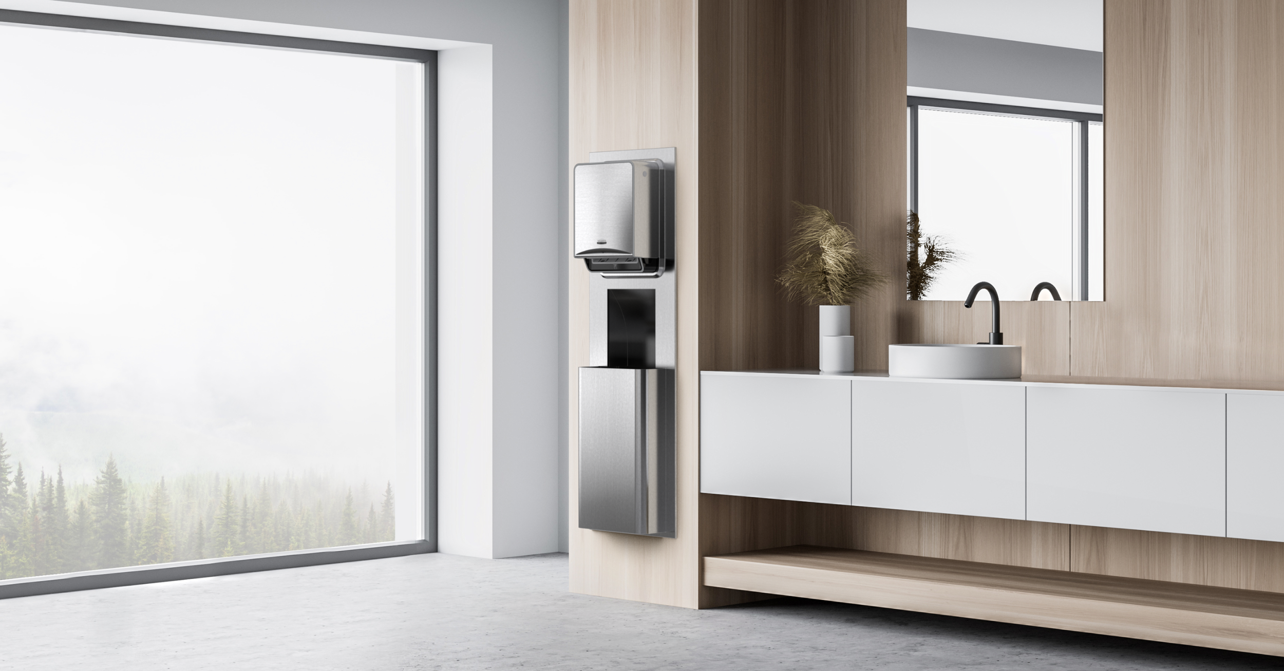


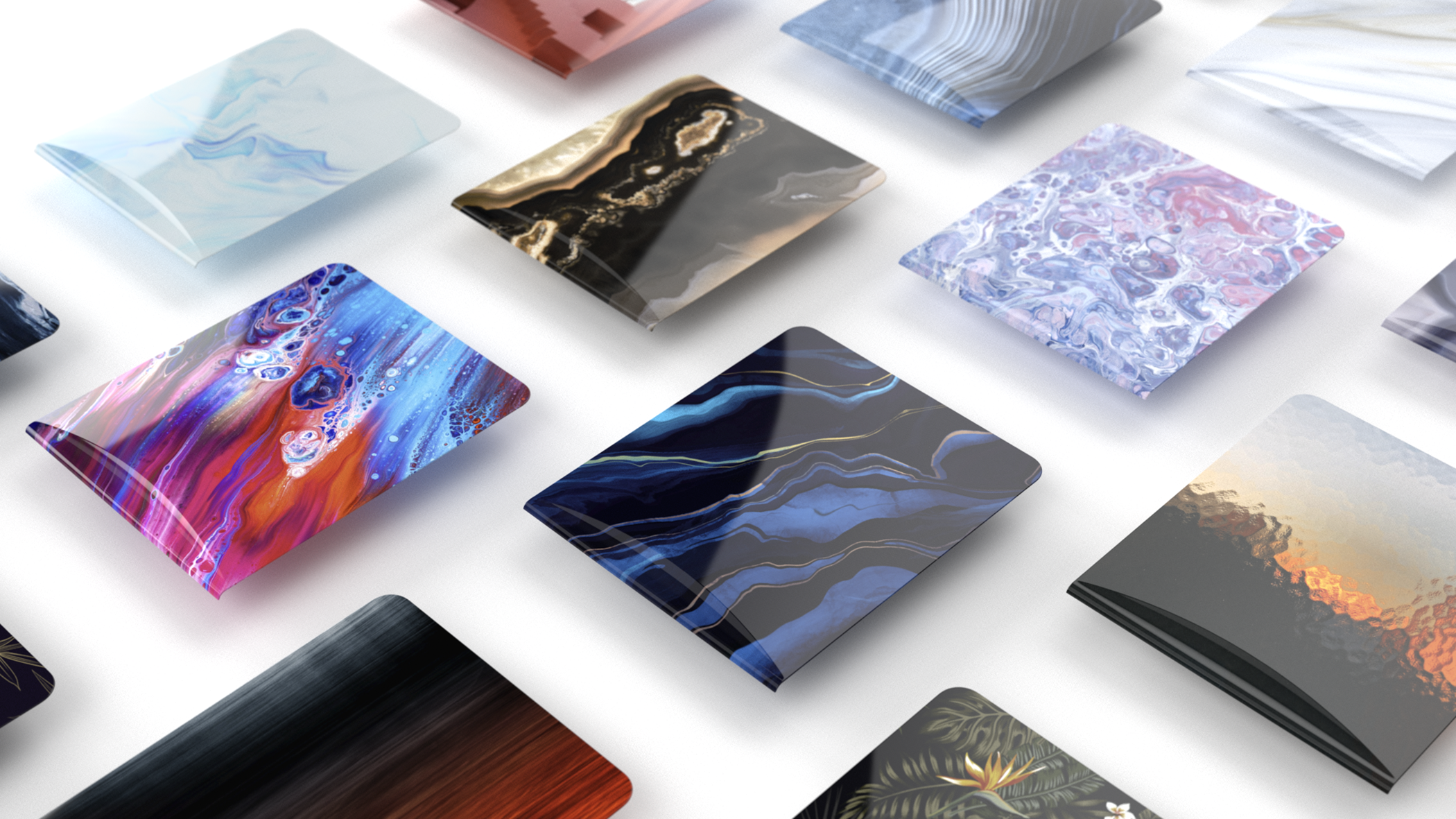
The initial launch features six, interchangeable faceplate styles developed with input from architects and interior designers. The platform is designed to support unlimited color, material, and finish customization.
Interior designers are afforded unprecedented design flexibility and opportunity for customization. Designers can now tailor dispenser appearance to complement their interiors instead of compromising their designs.
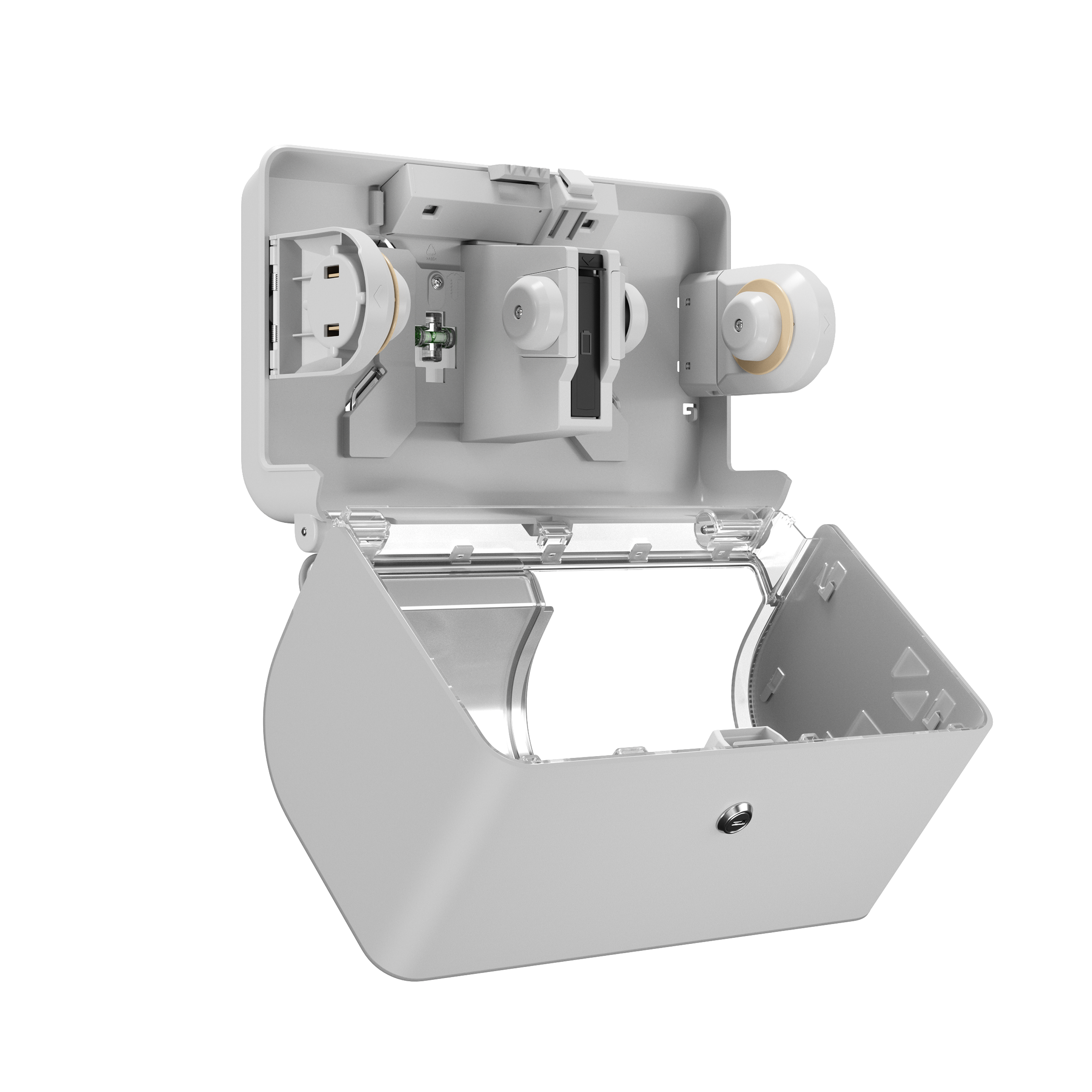
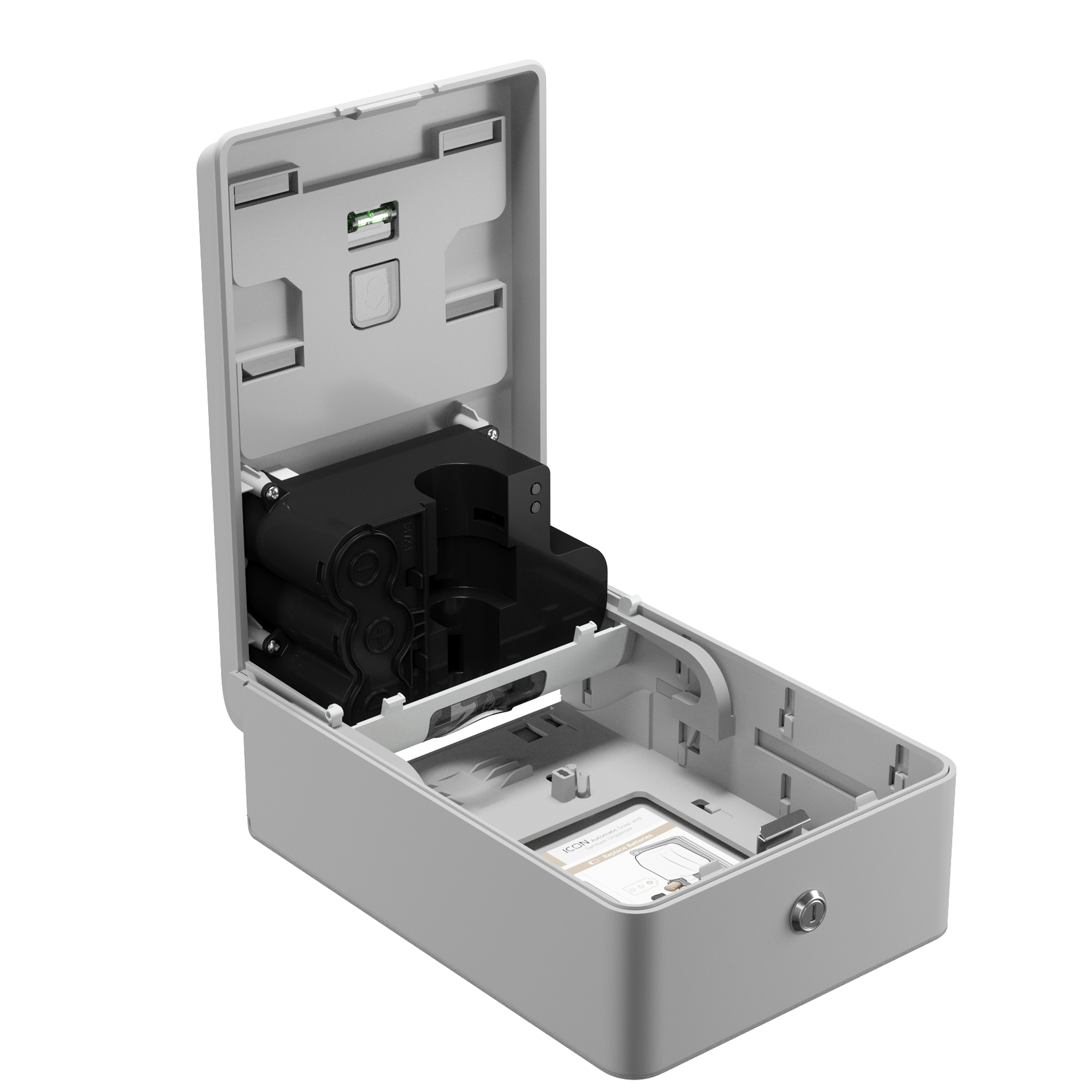
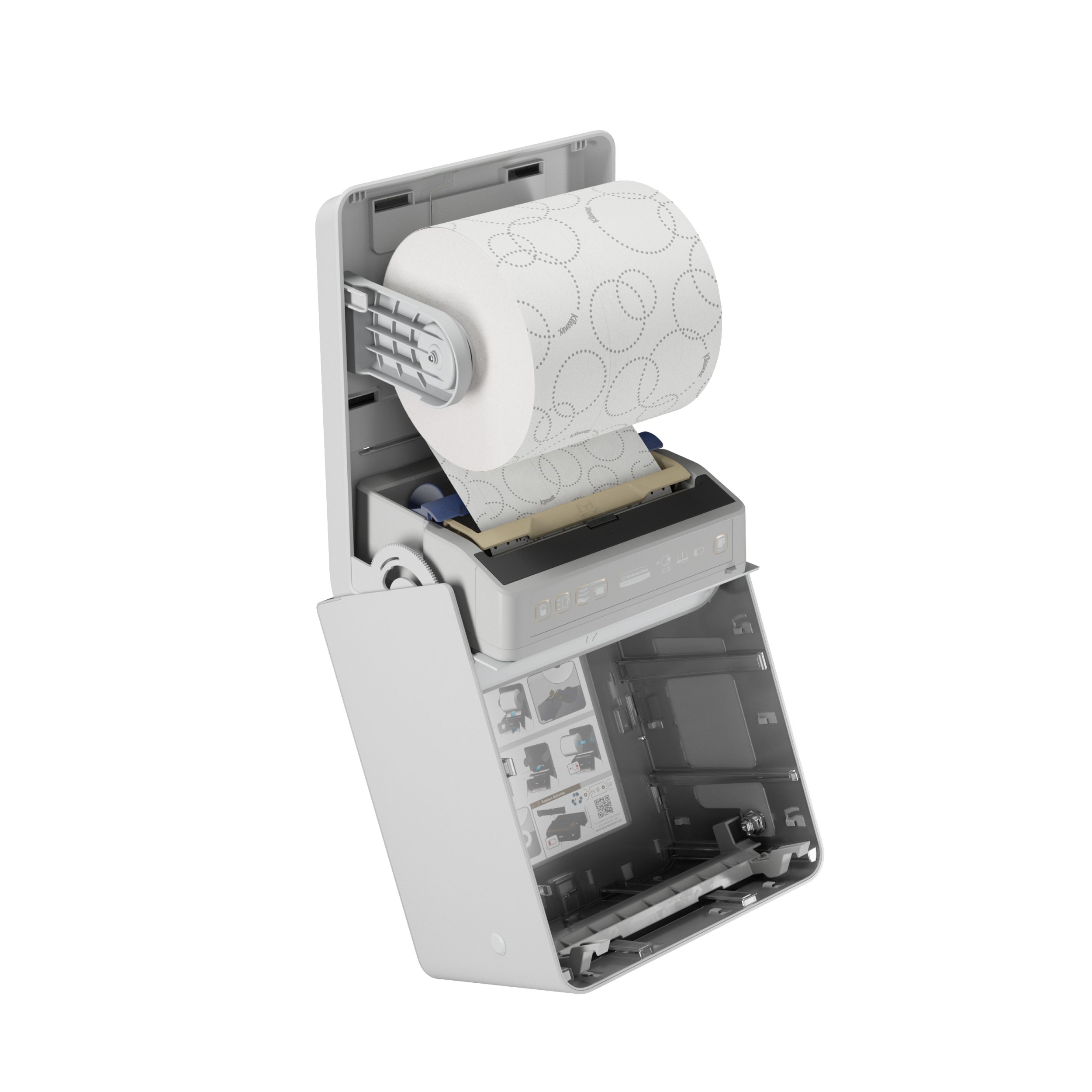
New materials and processes were developed to create unlimited faceplate offerings. The collection features 85% quieter dispensing, satisfying sounds, tactile feedback, and enhanced sensors that anticipate people’s interactions.
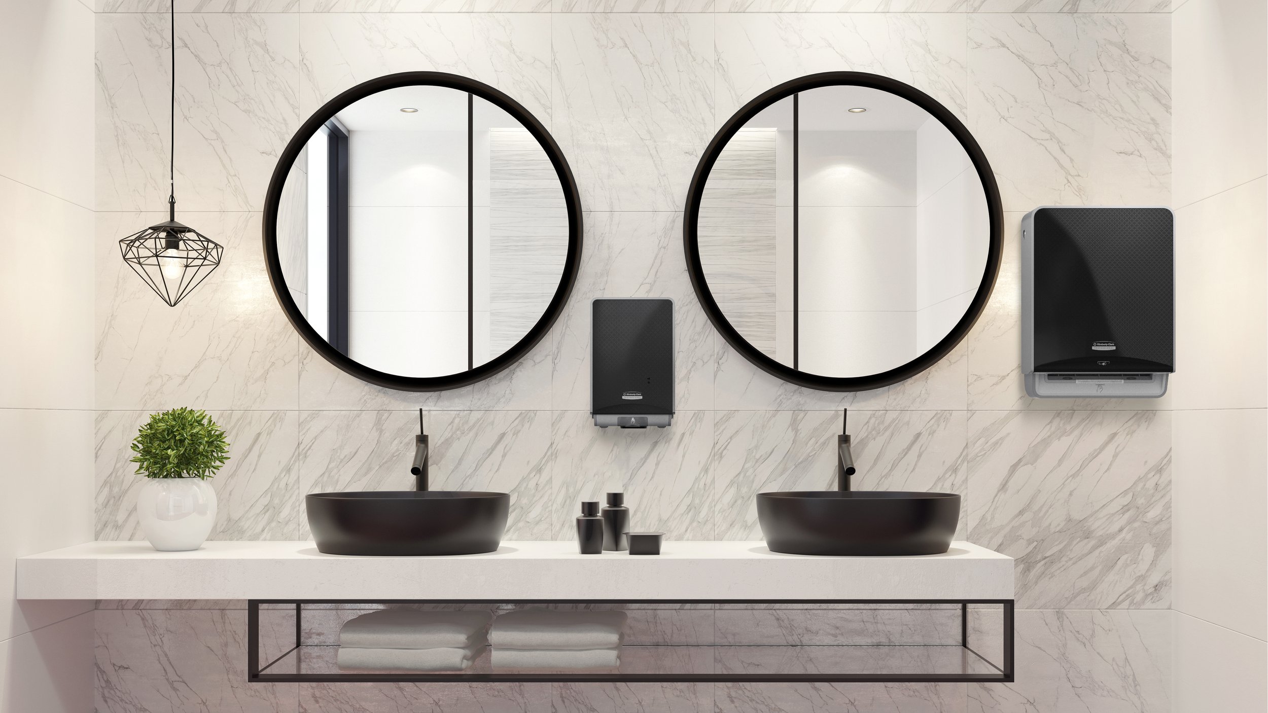
The ICON™ dispenser’s form and aesthetic design was informed by extensive visual research into interior trends. It emphasizes harmony and flexibility. Many existing dispensers were designed in isolation with a focus on basic functionality. They’re often designed without consideration or respect for the environments in which they’re placed. This ultimately has a negative impact on the perception of the product and the experience of using it.
The ICON™ dispenser was designed with timeless simplicity in mind. It is in harmony with today’s interiors and can easily adapt to changing trends and tastes to remain relevant. ICON™ dispensers are carefully crafted to complement spaces without attempting to serve as the focal point or star of the show; they are designed to fit in and also stand out.
The use of rational geometry creates understandable forms that provide the ideal blank canvas for unlimited aesthetic flexibility and expression. At launch the system included six carefully curated finish variations, which were informed by trends and evaluated in prototype form with architects, designers, and end users.
The system is intended to change and grow over time. In addition to curated CMF options, customers can upload bespoke imagery to create unique dispensers that match any environment and capture any personal or brand expression.